
Book design is both an art, and an educated guess. And a lot of trial and error, at least for me.
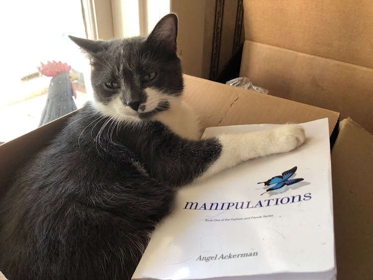
I am not trained as a book designer. My roots are in production, which serves one well when designing books. Design is great, but you have to get all the pieces of the puzzle in. Our first book, Manipulations, was laid out quite awhile ago and sat dormant for ages. Then it was thrust into production in July. August and September for me were a nightmare, and frankly I missed a bunch of errors. Things I call rookie mistakes. Angel said let them go. It’s quirky. As the designer I’m mortified.
The text for Courting Apparitions is already complete, and is in proofreading. Again my design software hated the French quotes and they will need to be changed manually. Tedious, but doable. The cover just needs the synopsis and the bar code and it’s ready to go as well. Launch date for CA is November 29. It should be to the printer by the 15th.
This series is 6×9, a trade paperback.
This week brought three more projects. I need to create a template for our poet, Darrell Parry, in the 6×9 format. I added a folio and marked where some things should go and that’s about it. He will do his own design work.
Yesterday, I began the layout stage for two more books. The first is Trapped by Seneca Blue. It’s a contemporary romance about an overweight middle-aged woman, her group of quirky friends and family she call Scoobies, and falling in love with the trapper she hires. Though the “Scoobie” part might have to change. Is it copyrighted? Hmmm. Things to think about.

I decided this book needed to be small. It’s a pocket romance. Something to quick stash in your purse, bag, or pocket. I looked on the printer’s website and they had a 4×7 inch size. I had one romance novel in my reference bin and it was about 4×7. I used 1/2 inch margins because that’s what the printer required. I generally use 10 point type. It’s not to small or not too large. Like the three bears, it was just right. I chose Adobe Calson (William Caslon, 1725; digitized 1989) because it’s an oldstyle serif font with a fairly large x-height. Translation: It’s readable. Seneca is a graphic designer and her heroine Ed is as well. The trapper’s logo is in Futura (Paul Renner, 1927) so it was the no-brainer choice for the chapter heads. In case you’re curious it’s a geometric sans serif.

When I placed the file into InDesign it came out as almost 3,300 pages. What the heck. There must have been some coding in the document that forced one paragraph per page. And if the author puts 10 returns between paragraphs it adds pages for them as well.
I worked some magic and returned it to the 278 pages it should be. At the 6×9 size this book would be about half that size. It’s ready for the proofreader.

Today I started working on William Prystauk’s Bondage. The next book in his Kink Noir series. This presented an unusual situation. I have to make this book look like the other three. From a PDF. I won’t bore you with the details but PDF hide a lot of information. It comes in handy when students want to take shortcuts.
The above photo is my notes. From this I could set up the file. As a teacher I find it deeply disturbing that a designer used four different old style serif fonts in one document. It’s pretty much the definition of font conflict. And it will kill me to replicate it.
They are:
Athelas (José Scaglione and Veronika Burian, 2006)
Hofler (Jonathan Hoefler, 2001)
Baskerville (John Baskerville, 1750s)
Palatino (Hermann Zapf, 1943)
This book, like the others, is 5.5×8.5. When I brought the file in, again, I ended up with nearly 4000 pages. In actuality it’s a little over 300 page.
I am also wrapping up a Holocaust memoir which goes to press soon. Certainly before the end of the year. When the author is in their 90s, time is important.
My final thought on book design comes the way of a former student. He does all the work himself including the covers. He asks my opinions and I give them. Last summer’s project was an anthology of essays written in the 80s at a community college in Florida. The students were refugees from Vietnam. The editor died before the book was published, so he finished it. He asked it the Vietnam flag would be appropriate for the cover and I thought nothing of it. I made suggestions and that’s what he went with.
He also works in academia, and managed to get himself booked on a podcast and was very excited about it. The interviewer was Vietnamese. When he sent the book he sent a pdf of the text, not the cover. The podcast was in the “can.” Before it aired, the interviewer finally saw the cover and had a melt-down of epic proportions and accused the former student of being culturally insensitive. The interview will not air.
Angel always tells me I think about these things too much. This is why. If someone did this with one of my book designs I’d crawl in a hole and probably never come out. Even worse, I am puzzled. I don’t see where the problem is. So instead of berating, should the person be educating?

Leave a comment