
Today is the coldest day so far this winter, with an actual temperate of six degrees Farenheit and an even lower wind chill. This is doubly surprising to me– even as someone accustomed to winter in the northeast United States– because so far this weekend, little, prone-to-be-cold publisher Angel Ackerman has been going outside in various sweatshirts.
And yet I had scheduled a meeting regarding our upcoming releases: The Phulasso Devotional and Coffee in the Morning.
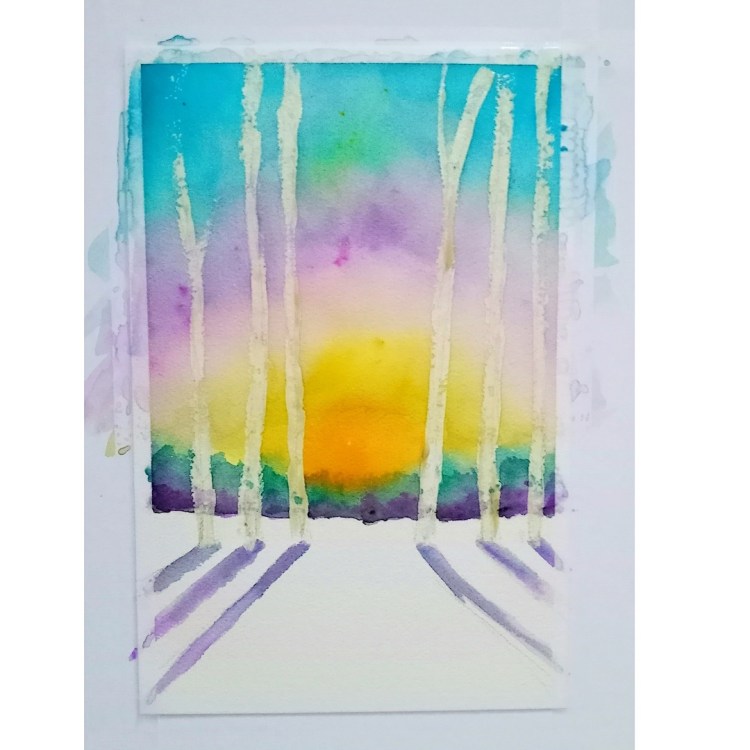
This morning, as I did not drink my morning coffee, I received an email from artist and frequent Parisian Phoenix contributor Maryann Riker, showing me the background pass of the watercolor she made for the cover of The Phulasso Devotional.
She mentioned she turned the heat up to 80 in her house and put the painting by the vent to dry. I told her I would be right over to keep warm.
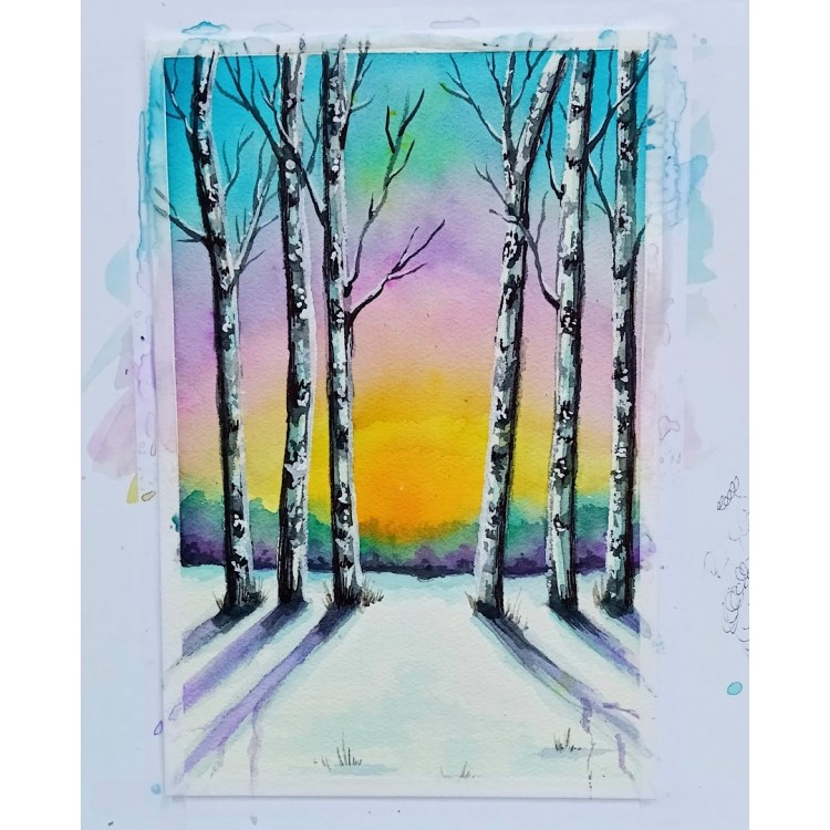
While discussing the upcoming projects and promotional materials with my art director Gayle Hendricks, Maryann sent an updated version. We both gasped, “Oh that’s pretty,” at the same time.
We discussed the idea of printing postcards with the original image with a small strip of type around the border that reads, “original painting by Maryann Riker, justarippress.com, for the cover of The Phulasso Devotional by Thurston D. Gill, Jr., parisianphoenix.com (2023).” Then we could use them to promote the book and frankly, sell them because they are gorgeous at events where we sell books.

So in a similar vein, we should do a promotional postcard of Maryann’s painting commissioned for Twists: Gathered Ephemera, going into it’s expanded second edition later this month. Poet Darrell Parry has adjusted some of the layout and added at least one new poem.
Lafayette College will feature him as part of its kickoff to National Poetry Month.
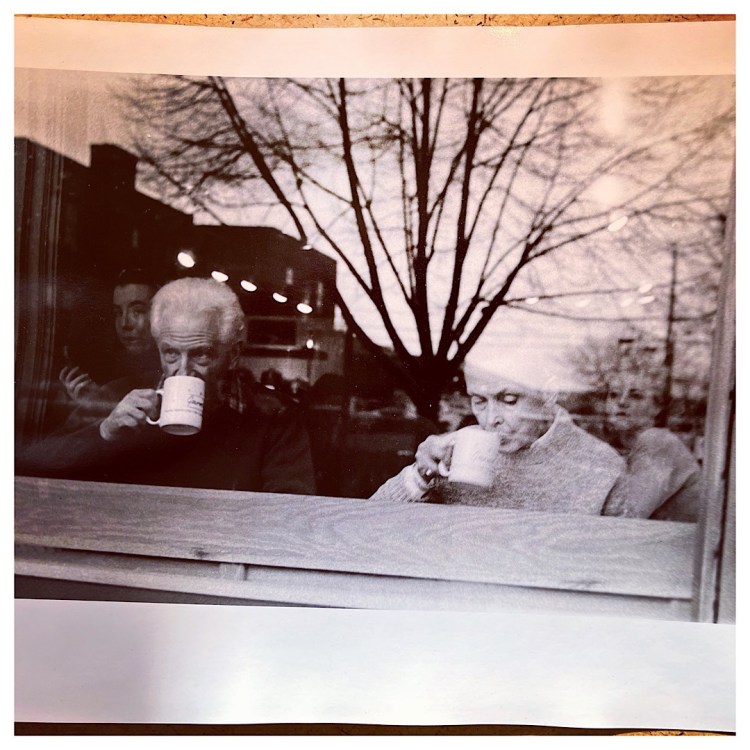
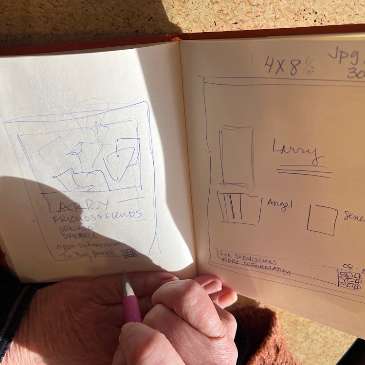
And when Larry Sceurman arrived at our meeting today, he brought the photo taken by his son that inspired the title Coffee in the Morning for his upcoming fiction anthology. The striking black-and-white image was taken something like thirty years ago, but it sums up the gritty yet poignant real-life depicted in his stories. (That might be another postcard!)
This is when the book design process becomes fun!

Speaking of book design, I passed along to Gayle a copy of Brené Brown’s Dare to Lead. I didn’t enjoy the book. It had decent information in it, but one can only read so many of those business leadership books. But it did have some unique concepts in book design.
It used a very curly script for its titles and headings, and a very plain, square sans serif for accents. And the layout was very open. This made the text easy to read or skim. But the curly script was squeezed together at different rates on different pages, so that made my eyes hurt. The use of bold and italic for emphasis was very cleanly done.

Leave a comment